3.0.8 Preview: Interface (Update)
Announcements and news by us. Post comments about them here.
posted on June 22nd, 2009, 11:44 pm
SaoMagnifico wrote:That sounds awesome to me, although it'd help if you could record a video of your AI in action and post it here...
Problem 1: I don't have a camera that records on a digital media card
Problem 2: I don't have access to a video posting website in which I can post it and then link it.
Problem 3: I want people to try it themselves (if you want to there is a pic of the Dominion play, I'll post more shots as progress continues).
posted on June 23rd, 2009, 12:18 am
Thank you thank you THANK YOU!!! "small, childlike voice" for getting rid of the cinematic window.
PS I hated the sterile look you first posted, the look that you've recently posted looks much better, and, well, more animated!
What can't you guys do?!!!
PS I hated the sterile look you first posted, the look that you've recently posted looks much better, and, well, more animated!

posted on June 23rd, 2009, 12:40 am
make it rain on the moon?
posted on June 23rd, 2009, 12:44 am
The new look is still good, but now I feel like its a terran UI for starcraft. Nice touch with the LCARS buttons for the mini map. Id still like to see more Lcars buttons used for the actual buttons. Heres a quick mock up i did in paint.


posted on June 23rd, 2009, 12:50 am
THat could actually work! i think...
posted on June 23rd, 2009, 1:52 am
If you ask me I personally like the direction that they are going for the ui... and for those of you that don't like the direction they are going in then why don't you come up with your own interface pack for fleetops... I mean a drastic change of any kind is going to set some people off. and personally I would like to see some more options in fleetops, besides you'll adapt 

posted on June 23rd, 2009, 9:13 am
Last edited by Exodus on June 23rd, 2009, 9:20 am, edited 1 time in total.
Bigmachk wrote:I like it tho I would like to make a suggestion. When you have a group of ships selected could you add the 5 system icons underneath each ship so you can see what system is disabled/damaged without having to manually select a ship to view its system icons?
When a subsystem is damaged or disabled, doesn't the icon appear persistantly below the ship anyway? So really that isn't necessary.
Dominus_Noctis wrote:Very neat fellas
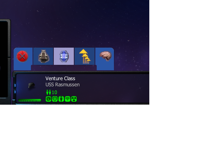
Hmm, I am a little confused though: how can we tell how much damage a system has taken, or how much life remains in the shields in the UI (not the ship in the field). Also, how many ships can be selected in a fleet now... So many questions...
I assume it's in a mousover pop-up and the pie chart style (or flashing) effect Armada does. Not sure what your asking about the sheilds, that looks the same to me

...and it looks like the maximum nuber of selectable ships is still 16, see the 3rd screenshot.
EDIT: Ooops... posted that before I actually read the rest of the thread...
Dominus_Noctis wrote:Any chance we could get a shield bar right above that green health bar in the UI... would be easier to see at a glance what ships could use a repair/shield recharge
Uh... no because it's already below it?

Njm1983 wrote:The new look is still good, but now I feel like its a terran UI for starcraft. Nice touch with the LCARS buttons for the mini map. Id still like to see more Lcars buttons used for the actual buttons. Heres a quick mock up i did in paint.
Wow, that's nice! But now I like both...

posted on June 23rd, 2009, 9:54 am
that lcars idea posted by Njm is interesting, but i fear that it is not realizable in the way he shows in the concept.
we planned to not individualize the buttons for each race anymore, instead the white button set is used for all races now.
posted on June 23rd, 2009, 10:20 am
I bet that makes things a bit easier for you guys.
A little sad to hear but I can understand why.
Or is this uniformity perhaps a hint to a cross-tech feature in the future?
A little sad to hear but I can understand why.
Or is this uniformity perhaps a hint to a cross-tech feature in the future?
posted on June 23rd, 2009, 11:29 am
Optec wrote://www.fleetops.net/images/Gallery/FleetOps3Federation/thumbs/FOScreenShot_090622_212639.png
The latest update to the Federation interface
It's alive!

Now we're talking!

posted on June 23rd, 2009, 11:52 am
Xenovore wrote:I bet that makes things a bit easier for you guys.
A little sad to hear but I can understand why.
Or is this uniformity perhaps a hint to a cross-tech feature in the future?
it has various advantages for you and for us. especially visibility for the autonomy buttons is much clearer with bright buttons. in general toggled weapon systems are much easier to identify. when you board another race's vessel you now have a uniform button design instead of a mix. of course for us it saves some time to have an identical design on all buttons. plus not to forget, the white buttons are a homage to the good old armada 1

posted on June 23rd, 2009, 12:13 pm
I love the look of the new interface!
I think having a uniform set of buttons makes sense, not to mention as Doca points out they will be easier to see which ones are selected or not selected.
Keep up the great work guys!!

Keep up the great work guys!!
posted on June 23rd, 2009, 12:45 pm
Looking good!
posted on June 23rd, 2009, 12:52 pm
shame the race specific buttons are being removed but i guess we can re-add them
posted on June 23rd, 2009, 12:53 pm
Hey, they just made build button making easier Blade. At least there is only one colour to use for the background! So less editing for the UI makers. 

Who is online
Users browsing this forum: No registered users and 8 guests