Systembackground sprites and so forth

posted on November 9th, 2012, 12:26 am
Hello all,
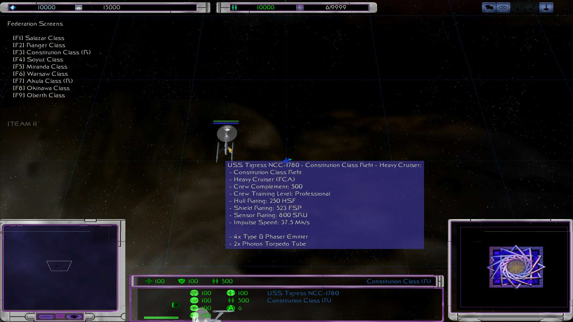
Decided, mainly to see if it would work nicely for KA2, to try and add FleetOps style weapon icons on the ship display.
EDIT: Okay, after digging through ze forum, I have discovered that for them to work you also need to define a systembackground sprite.
I have made a suitable sprite tga file for my test ship (Conny refit) and I have again made a cut down spr file to match. Thus;
The name of my SOD file is FConstitutionR.sod, and the name of my sprite file is FCruiseSI.tga (Federation Cruiser System Icon). Made sure it had the right alpha channel also. TGA in the textures folder, systembackgrounds.spr in the sprites folder.
Run the map editor. Same old wireframe image is there. (3/4 view from from rather than the new top down FLoPs style one). As far as I can tell FleetOps still has wireframe entries, albeit just for w1 so it shows when the shield generator is disabled or destroyed. I then removed the Conny refits GUI Global wireframe entry and made my own miniimages.spr file thus;
Added the following lines to gui_global
If I run the map editor now, the wireframe has disappeared altogether, with the miniimage and systembackground nowhere to be seen. Am I not defining something correctly? Rather oddly, the weapon icon now appears, although no name or tooltip does. Assuming that is because my otherwise default A2 weapon doesn't have them yet.
Any ideas on why my miniimage and systembackground are not appearing?
EDIT2: Right, figured out my error at least.; Of course for a smaller file the reference would need to be smaller.
Miniimage now works. Still trouble with the system background though.
I then get a small squished image of a Sabre, or a Conny if I edit the tga in question, in the middle of my GUI. Thus;
Full Size
http://img141.imageshack.us/img141/3220/messedupicon.jpg
It's odd because the FleetOps GUI layout doesn't seem massive different to my own. Where is the offset that controls where the sprite appears and it's dimensions?
Decided, mainly to see if it would work nicely for KA2, to try and add FleetOps style weapon icons on the ship display.
EDIT: Okay, after digging through ze forum, I have discovered that for them to work you also need to define a systembackground sprite.
I have made a suitable sprite tga file for my test ship (Conny refit) and I have again made a cut down spr file to match. Thus;
- Code: Select all
sprite_table
@reference=1024
@tmaterial=interface
@skip=off
fconstitutionr_si fcruisesi 0 0 512 128
The name of my SOD file is FConstitutionR.sod, and the name of my sprite file is FCruiseSI.tga (Federation Cruiser System Icon). Made sure it had the right alpha channel also. TGA in the textures folder, systembackgrounds.spr in the sprites folder.
Run the map editor. Same old wireframe image is there. (3/4 view from from rather than the new top down FLoPs style one). As far as I can tell FleetOps still has wireframe entries, albeit just for w1 so it shows when the shield generator is disabled or destroyed. I then removed the Conny refits GUI Global wireframe entry and made my own miniimages.spr file thus;
- Code: Select all
sprite_table
@reference=1024
@tmaterial=interface
@skip=off
fconstitutionRw1   fcruiseWire      0   0   64   64
Added the following lines to gui_global
- Code: Select all
@include miniimages.spr
@include systembackgrounds.spr
@include systemimages.spr
If I run the map editor now, the wireframe has disappeared altogether, with the miniimage and systembackground nowhere to be seen. Am I not defining something correctly? Rather oddly, the weapon icon now appears, although no name or tooltip does. Assuming that is because my otherwise default A2 weapon doesn't have them yet.
Any ideas on why my miniimage and systembackground are not appearing?
EDIT2: Right, figured out my error at least.; Of course for a smaller file the reference would need to be smaller.
- Code: Select all
sprite_table
@reference=64
@tmaterial=interface
@skip=off
fconstitutionrw1 fcruiseWire 0 0 64 64
Miniimage now works. Still trouble with the system background though.
- Code: Select all
sprite_table
@reference=1024
@tmaterial=interface
@skip=off
fconstitutionr_si systembackgrounds1 0 0 512 128
I then get a small squished image of a Sabre, or a Conny if I edit the tga in question, in the middle of my GUI. Thus;
Full Size
http://img141.imageshack.us/img141/3220/messedupicon.jpg
It's odd because the FleetOps GUI layout doesn't seem massive different to my own. Where is the offset that controls where the sprite appears and it's dimensions?

posted on November 9th, 2012, 2:59 am
Make sure your texture is square and your @refrence matches the dimensions. You can get strange results when not using the same texture dimension as Stock FO. 
Also, it looks like your race gui file might be messed up if you are using a non stock FO one, or maybe a smaller or uncommon resolution. The ship stats should be closer to the middle of the box to make room for the systembackground image.
Also, it looks like your race gui file might be messed up if you are using a non stock FO one, or maybe a smaller or uncommon resolution. The ship stats should be closer to the middle of the box to make room for the systembackground image.
posted on November 9th, 2012, 3:34 am
Hmm I had a feeling it might be the GUI. Bummer. Well, I hope the weird offset remains consistent. Since my ships have considerably more weapons than FleetOps ones, there isn't really enough space for a proper systembackground. What I've done as a fix is to use the same transparent sprite for all ships, and then set the weaponicons out on a grid that fills the area formerly used for the wireframe.
The result is that the wireframe area is now a sort of "weapons panel" whereby you can see at a glance what weapons your ship has available and their relative recharge rates.
The result is that the wireframe area is now a sort of "weapons panel" whereby you can see at a glance what weapons your ship has available and their relative recharge rates.
posted on November 9th, 2012, 4:11 am
Alternatively, if you leave out the systembackground, it will actually just use the miniimage in its place, and you could then just use the extra space to make a list of your weapons or something, instead of doing it exactly like FO.
posted on November 9th, 2012, 3:56 pm
Hey, thats a great interface. You do it yourself? Could you make me a few for my mod? 

posted on November 9th, 2012, 6:46 pm
well i did fix the gui issue with my mod by reordering information on the gui so i guess you could take a look at the gui references.
posted on November 9th, 2012, 8:53 pm
Destroyer, I didn't make the original but I did modify and recolour an existing GUI (It was a Protoss GUI by Slider, I think). I have made other GUIs though. Depends on what you are after  I haven't quite figured out why it has little gaps in it (like the grey line in the map display) All the alphas are correct, but ah well, it's not too noticeable. And hey, the mark of a good GUI is that actually you don't notice it. You use it without really having to think consciously about it.
Blade, my current implementation seems to work well enough for my purposes However if I encounter any further issues I'll drop you a PM on the subject. I am figuring the issue is with me using old A2 style GUIs (designed for 4:3 aspect ratios) with a game that now supports 5:3 and 16:9 ratios.
I haven't quite figured out why it has little gaps in it (like the grey line in the map display) All the alphas are correct, but ah well, it's not too noticeable. And hey, the mark of a good GUI is that actually you don't notice it. You use it without really having to think consciously about it.Blade, my current implementation seems to work well enough for my purposes
However if I encounter any further issues I'll drop you a PM on the subject. I am figuring the issue is with me using old A2 style GUIs (designed for 4:3 aspect ratios) with a game that now supports 5:3 and 16:9 ratios.posted on November 13th, 2012, 4:22 pm
Depends on what you are after
I'm looking for a GUI for the TCF, one of the factions of my mod.
I've been so focused on the way the Destroyers look that I have no ideas for the TCF interface.
Also, I'm having some problems making the loading screen.
If you could help me here, that would be sweet.
posted on November 13th, 2012, 6:53 pm
Loading screens are quite straightforward. There are two ways to do them; either alter the logo.sod or alter the required loading tga files. The first way means your loading screen will look nice at any resolution, but the second way is a lot easier and frankly unless at a stupidly high forced resolution you won't really encounter much of a quality issue.
So, basically, make a nice 512 x 768 screen for use as a loading screen. I tried doubling the resolution to 1024 x 1536, but a slight mapping error on the 2d plane that the loading screen is mapped to really shows up badly when you do that, so leave it at 512 x 768.
I use Photoshop, but I am sure you can do the same with Gimp. You need to make a layer on top of your loading screen to help divide the loading screen into the 6 parts you need. It's just easier and more precise than trying to eyeball it. Using the selection tool set to a fixed size of 256 x 256, draw a box in the top left of the loading screen image. Paint that box white. Now do the same in the bottom left. Paint that white. In the top right of the loading screen, do the same and paint it black. Repeat until you have a checkerboard pattern of two rows, the top row WBW, the bottom BWB.
This will allow you to easily select those areas using your new mask layer, and copy and paste the actual screen section to it's own file. The files are named LOADINGx.tga, with x being from 1 to 6. The top row of WBW is comprised of LOADING1, LOADING2, LOADING3, and the bottom LOADING4, LOADING5 and LOADING6.
Once you've split your loading screen into those 6 files, save in the texture directory with those file names and it should show next time you run your mod
With GUIs, it's a bit more complex. First thing to decide is what style you want for your race. Best continue GUI talk via PM. Send me a message
posted on November 15th, 2012, 8:21 am
Loading screens are quite straightforward. There are two ways to do them; either alter the logo.sod or alter the required loading tga files. The first way means your loading screen will look nice at any resolution, but the second way is a lot easier and frankly unless at a stupidly high forced resolution you won't really encounter much of a quality issue.
So, basically, make a nice 512 x 768 screen for use as a loading screen. I tried doubling the resolution to 1024 x 1536, but a slight mapping error on the 2d plane that the loading screen is mapped to really shows up badly when you do that, so leave it at 512 x 768.
I use Photoshop, but I am sure you can do the same with Gimp. You need to make a layer on top of your loading screen to help divide the loading screen into the 6 parts you need. It's just easier and more precise than trying to eyeball it. Using the selection tool set to a fixed size of 256 x 256, draw a box in the top left of the loading screen image. Paint that box white. Now do the same in the bottom left. Paint that white. In the top right of the loading screen, do the same and paint it black. Repeat until you have a checkerboard pattern of two rows, the top row WBW, the bottom BWB.
This will allow you to easily select those areas using your new mask layer, and copy and paste the actual screen section to it's own file. The files are named LOADINGx.tga, with x being from 1 to 6. The top row of WBW is comprised of LOADING1, LOADING2, LOADING3, and the bottom LOADING4, LOADING5 and LOADING6.
Once you've split your loading screen into those 6 files, save in the texture directory with those file names and it should show next time you run your mod
I've done that. My problem is that I was hoping for a loading bar that went from the bottom of a section up to the top. I have a better idea that I can use instead and will probably use it and forgo the new loading bar.
GUI talk via PM. Send me a message
Never done that before. How do I?
posted on November 15th, 2012, 11:41 am
A vertical loading bar might be possible. Its controlled in the loading.odf file.
We can talk about your GUIs here if you wish This TCF, what kind of technology do they use? Are they biological, cybernetic? etc What sort of style of GUI would fit them?
We can talk about your GUIs here if you wish
This TCF, what kind of technology do they use? Are they biological, cybernetic? etc What sort of style of GUI would fit them?posted on November 15th, 2012, 4:54 pm
A vertical loading bar might be possible. Its controlled in the loading.odf file.
I can never get it right. Its either too wide or doesnt show up at all.
We can talk about your GUIs here if you wish
That might be better.
what kind of technology do they use? Are they biological, cybernetic? etc What sort of style of GUI would fit them
The best way to describe them is the humans from Halo.
The difference between the TCF and the UNSC, is that the TCF is split into four factions, the Vega-Punks, the Carnage, the Attrition, and the Sci-Corp.
Each group uses different weapons and systems. Vegas use Machine-gun-style weapons, the Carnage use Auto-Cannons, the Attrition use lasers, and the Sci-Corp use Plasma. Missiles are used by the Vegas and Carnage and torpedoes are used by the Carnage, the Attrition, and the Sci-Corp. As such, the Sci-Corp are more advanced while the Vega-Punks are the least.
I was hoping for a GUI that could be used on all four groups, but still looked good enough to be ingame. Any ideas?
posted on November 15th, 2012, 6:53 pm
Right, well without sounding too boring, something fairly plain and grey might be best.
posted on November 16th, 2012, 3:06 am
Sounds good. Maybe some 'crude' holographics too. Just an idea.
Who is online
Users browsing this forum: Bing [Bot] and 5 guests