Twilight

What's your favourite episode? How is romulan ale brewed? - Star Trek in general :-)
1 ... 4, 5, 6, 7, 8
posted on August 1st, 2005, 10:17 pm
Last edited by DOCa Cola on August 1st, 2005, 10:26 pm, edited 1 time in total.
yes, the design is similar to that of fleet operations, but that doesn't matter to me. but the buttons, i atleast see that two of them were done from these i made for fleet operations. i think you should have made new ones for these too, it would have just fit your design better. i don't know why they base on the fleet operations buttons anyway - you want to see if we notice again? :D here you go
Image
notice the yellow bar here at the left, it is about the same size the black space is in the fleet operations version, a indication for me, it is based of the button of fleet operations. also the borderline of the inner button has the same transparency here

Image
what should i say here, the border is clearly the fleet operations one
posted on August 2nd, 2005, 8:15 am
Last edited by AdmarilRyan on August 2nd, 2005, 8:16 am, edited 1 time in total.
Your a sucisious so and so aren't you doca. The buttons in game will be replaced as for that well thats something only you would notice so thats not so bad as it is a completly different colour anyway consider it a compliment.
posted on August 2nd, 2005, 8:32 am
Last edited by DOCa Cola on August 2nd, 2005, 9:30 am, edited 1 time in total.
yes, it is a compliment for first talking of how much better your mod will be and then copy materials from fleet operations and recolour them and saying they are yours because only i would notice the difference. it's offending, don't you think? i don't want to fight with you two anyway. it's just think that Yacuzza made a nice interface here and i am sure he could do a nicer one without being based on fleet operations to make a real unique mod out of twilight.
posted on August 2nd, 2005, 9:12 am
your right your right sorry, the mod will be considerably different to fleetops in the end but I guess we needed a leg up to start off so to speak.
posted on August 2nd, 2005, 9:14 am
i don't like the pink!!!
posted on August 2nd, 2005, 11:28 am
It looks more like a fed computer interface now besides it's what happens after this screen that really matters!
posted on August 2nd, 2005, 1:08 pm
aye but its the little things that count ;)
posted on August 2nd, 2005, 1:20 pm
any thing wrong now ?

Image
posted on August 2nd, 2005, 1:23 pm
i think you should do it a colour more suited to the theme: the Twilight, perhaps a midnight blue, in place of the pinkish-purple :)


BTW do i detect a hint of sarcasm? ;)
posted on August 2nd, 2005, 1:26 pm
I think it's much better i can read whats in the buttons now!
posted on August 2nd, 2005, 1:29 pm
not saying to change the colour of writing inside boxes, just the pinkih-purple parts, doubt that would affect the in-box writing. give a try and see what happens ;)
posted on August 2nd, 2005, 6:28 pm
not saying to change the colour of writing inside boxes, just the pinkih-purple parts, doubt that would affect the in-box writing. give a try and see what happens ;)

excatly!!!
posted on August 2nd, 2005, 6:55 pm
The problem I had before was white writing on a light pinky peach background but now it's brilliant!
posted on August 2nd, 2005, 7:55 pm
lets see! or is it the one above?
posted on August 4th, 2005, 9:19 am
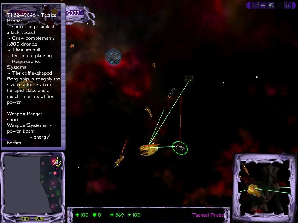
Image

Ok this was taken in a AI test I was doing on the borg the AI worked well, too well or at least balencing is required.

note borg and 8472 no longer have shields in this picture
1 ... 4, 5, 6, 7, 8
Locked

Who is online

Users browsing this forum: No registered users and 3 guests